
Wikipedia:Graphics Lab/Photography workshop/Archive/Mar 2016
Fire Temple[edit]
.jpg)
- Article(s)
- Fire Temple
- Request
- can something be done to reduce the reflection? thanks… -- Kintetsubuffalo (talk) 16:12, 6 March 2016 (UTC)
- Graphist opinion(s)
![]() Done. Well, there was nothing that could be done other than to replace the image, so I took that one from Flickr. I've also updated the file description page with the correct license information and wotnot. How's that? nagualdesign 21:17, 12 March 2016 (UTC)
Done. Well, there was nothing that could be done other than to replace the image, so I took that one from Flickr. I've also updated the file description page with the correct license information and wotnot. How's that? nagualdesign 21:17, 12 March 2016 (UTC)
- Sorry so late. Yeah, that's way better, thanks. It's okay to snag from Flickr?--Kintetsubuffalo (talk) 02:41, 19 March 2016 (UTC)
- Only if it has the correct licence. This new one is CC BY-SA 2.0, which is permissible on Commons. nagualdesign 18:33, 22 March 2016 (UTC)
messier objects[edit]
.jpg)
- Article(s)
- messier objects
- Request
- please remove watermark, maybe center bottom row… -- Kintetsubuffalo (talk) 16:31, 6 March 2016 (UTC)
- Graphist opinion(s)
![]() Done I didn't center the bottom row because I thought it looked fine left justified, and because the images are of different sizes without hard borders between them. It just wouldn't have looked good without an hour or two's effort retouching afterwords. MjolnirPants Tell me all about it. 18:27, 8 March 2016 (UTC)
Done I didn't center the bottom row because I thought it looked fine left justified, and because the images are of different sizes without hard borders between them. It just wouldn't have looked good without an hour or two's effort retouching afterwords. MjolnirPants Tell me all about it. 18:27, 8 March 2016 (UTC)
- Okay, bueno! Thank you!--Kintetsubuffalo (talk) 00:55, 9 March 2016 (UTC)
- That's not messier. It's neater.
- (I apologise unreservedly but I couldn't help it) (Hohum @) 19:15, 9 March 2016 (UTC)
- (Slow clap) Bravo. 'Twas a puntastic job you did there. MjolnirPants Tell me all about it. 19:18, 9 March 2016 (UTC)
George W. Bush and Luiz Inácio Lula da Silva[edit]
- Article(s)
- Brazil–United States relations
- Request
- Please remove the white borders -- Vinícius O. (talk) 04:35, 21 March 2016 (UTC)
- Graphist opinion(s)
 Done White space removed. Centpacrr (talk) 13:53, 21 March 2016 (UTC)
- Thank you! -- Vinícius O. (talk) 05:27, 22 March 2016 (UTC)
Church in London[edit]

- Article(s)
- Calouste Gulbenkian
- Request
- Is it me, or is this church tilted? If so, can we straighten it out? You can crop it a big if need-be. As long as it looks straight. Thanks in advance, Étienne Dolet (talk) 05:49, 21 March 2016 (UTC)
![]() Done Perspective adjusted & cropped. Centpacrr (talk) 13:51, 21 March 2016 (UTC)
Done Perspective adjusted & cropped. Centpacrr (talk) 13:51, 21 March 2016 (UTC)
- Updated @Centpacrr: For future reference, you should plumb up any vertical lines at or very near the vanishing point to get the 'flattest' looking angle. MjolnirPants Tell me all about it. 15:12, 21 March 2016 (UTC)
Bernard Shaw by Alvin Langdon Coburn[edit]
-
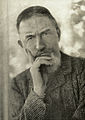 1911 photograph of George Bernard Shaw by Alvin Langdon Coburn

- Article(s)
- George Bernard Shaw
- Request
- This fine study of its subject, by a distinguished photographer, is rather faded and has wisps of white here and there: could it be improved, please?-- Tim riley talk 09:48, 22 March 2016 (UTC)
- Graphist opinion(s)
![]() Request taken. MjolnirPants Tell me all about it. 14:03, 22 March 2016 (UTC)
Request taken. MjolnirPants Tell me all about it. 14:03, 22 March 2016 (UTC)
![]() Done Let me know how it looks. MjolnirPants Tell me all about it. 15:13, 22 March 2016 (UTC)
Done Let me know how it looks. MjolnirPants Tell me all about it. 15:13, 22 March 2016 (UTC)
- Sorry for butting in. I've uploaded a lighter version without the blurring / grain reduction. and closer to the original hue. Revert as preferred. (Hohum @) 16:22, 22 March 2016 (UTC)
- Thank you both very much. Both versions are a great improvement on the original. Would it be possible to remove the cloudy patches of white from the subject's hair and above his right (our left) eyebrow?
- Cleaned up cloudy patches in Shaw's hair and face; removed several creases in the image that had been missed earlier. Centpacrr (talk) 17:37, 22 March 2016 (UTC)
- That's marvellous. Thank you so much. We're aiming to get the article to FA, and it will be excellent to have a lead image so much improved. Tim riley talk 17:53, 22 March 2016 (UTC)
- @Centpacrr: You painted over the highlights on his hair with a blurry brush. I reverted because it only looks good zoomed way out. MjolnirPants Tell me all about it. 18:26, 22 March 2016 (UTC)
- I've tweaked the hair a bit more at 100% to meet what the OP requested (removing the smudges in hair and face and remove three paper creases missed by others. The OP now has more than enough versions to pick from so let's leave it up to him to decide which one best suits his needs. Centpacrr (talk) 18:42, 22 March 2016 (UTC)
- @Centpacrr: You painted over the highlights on his hair with a blurry brush. I reverted because it only looks good zoomed way out. MjolnirPants Tell me all about it. 18:26, 22 March 2016 (UTC)
- That's marvellous. Thank you so much. We're aiming to get the article to FA, and it will be excellent to have a lead image so much improved. Tim riley talk 17:53, 22 March 2016 (UTC)
- Cleaned up cloudy patches in Shaw's hair and face; removed several creases in the image that had been missed earlier. Centpacrr (talk) 17:37, 22 March 2016 (UTC)
- Thank you both very much. Both versions are a great improvement on the original. Would it be possible to remove the cloudy patches of white from the subject's hair and above his right (our left) eyebrow?
Question: Can you not make out the difference between the hair highlight on the left side of the white area, and the white smudge on the right? I'm seriously asking, not trying to be sarcastic. This version does look quite a bit better than the version I reverted, but the missing highlight is a little glaring. Also, the smudge on his face was a good catch, it looked like direct light until you zoom in on it, which is why I (and presumably Hohum) missed it. MjolnirPants Tell me all about it. 18:56, 22 March 2016 (UTC)
- The white area in the hair does not appear to me to be a natural "highlight", and comparing this image to dozens of others of Shaw I do not see any other image that has an odd hair "highlight" like this one which really looks quite unnatural to me. (In the original image it also seems to extend in to the background.) Even though this image is of Shaw at age 55 he still clearly has dark hair. I also repaired three creases in the image on just to the left of his face. As the OP requested the light patch in the hair be removed let's leave it to him to decided what version he likes. Centpacrr (talk) 19:14, 22 March 2016 (UTC)
- I wasn't referring to a highlight as in the common practice of highlighting one's hair with lighter colored patches or strands, but to an actual highlight. You can clearly see hair texture which fades out exactly as it would if light were shining on it on the left side of the white patch. It's probably not as blown out as it looks in the original, but that's clearly a highlight. Finally, why do you keep bringing up the creases? Nobody's mentioned them but you. MjolnirPants Tell me all about it. 20:51, 22 March 2016 (UTC)
Well I removed the hair "highlight" and the white splotch on the face because the OP requested it, and because it also looked odd to me. (I actually also made a study with the "highlight" in it but subdued and that looked "off" to me as well.) I removed the creases because there were there and clearly didn't belong. Nobody had to mention them or ask me to do so, and I suppose nobody else noticed them either. Whatever version the OP wants to use of the many available to him to choose from is fine with me. Centpacrr (talk) 22:23, 22 March 2016 (UTC)
Mongolia[edit]

- Article(s)
- Mongolia
- Request
- please remove background… -- Kintetsubuffalo (talk) 11:23, 31 March 2016 (UTC)
- Thank you!--Kintetsubuffalo (talk) 16:10, 31 March 2016 (UTC)