Talk:Aryna Sabalenka
| Aryna Sabalenka has been listed as one of the Sports and recreation good articles under the good article criteria. If you can improve it further, please do so. If it no longer meets these criteria, you can reassess it. Review: January 6, 2019. (Reviewed version). |
| The contentious topics procedure applies to this page. This page is related to articles about living or recently deceased people, and edits relating to the subject (living or recently deceased) of such biographical articles, which has been designated as a contentious topic. Editors who repeatedly or seriously fail to adhere to the purpose of Wikipedia, any expected standards of behaviour, or any normal editorial process may be blocked or restricted by an administrator. Editors are advised to familiarise themselves with the contentious topics procedures before editing this page. |
| This article must adhere to the biographies of living persons (BLP) policy, even if it is not a biography, because it contains material about living persons. Contentious material about living persons that is unsourced or poorly sourced must be removed immediately from the article and its talk page, especially if potentially libellous. If such material is repeatedly inserted, or if you have other concerns, please report the issue to this noticeboard.If you are a subject of this article, or acting on behalf of one, and you need help, please see this help page. |
| This article is rated GA-class on Wikipedia's content assessment scale. It is of interest to the following WikiProjects: | ||||||||||||||||||||||||||||||||||||||||||||||||||||||
| ||||||||||||||||||||||||||||||||||||||||||||||||||||||
| This article has been viewed enough times in a single week to appear in the Top 25 Report 4 times. The weeks in which this happened: |
GA Review
[edit]| GA toolbox |
|---|
| Reviewing |
- This review is transcluded from Talk:Aryna Sabalenka/GA1. The edit link for this section can be used to add comments to the review.
Reviewer: MWright96 (talk · contribs) 10:05, 4 January 2019 (UTC)
Shall take a look at this article. MWright96 (talk) 10:05, 4 January 2019 (UTC)
- It is reasonably well written.
- It is factually accurate and verifiable.
- a (reference section):
 b (citations to reliable sources):
  c (OR):
- a (reference section):
- It is broad in its coverage.
- a (major aspects):
 b (focused):
- a (major aspects):
- It follows the neutral point of view policy.
- Fair representation without bias:

- Fair representation without bias:
- It is stable.
- No edit wars, etc.:

- No edit wars, etc.:
- It is illustrated by images and other media, where possible and appropriate.
- a (images are tagged and non-free content have fair use rationales):
 b (appropriate use with suitable captions):
- a (images are tagged and non-free content have fair use rationales):
- Overall:
- Pass/Fail:

- Pass/Fail:
Early life and background
[edit]- Whereabouts is Belarus' National Tennis Academy?
- Added that it's in Minsk (with a new source to show that). Sportsfan77777 (talk) 04:29, 6 January 2019 (UTC)
Junior career
[edit]- "or any of the other high-level Grade A and Grade 1 events." - or any other
- "she had a career-high ranking of just No. 225." - add the abbr template to No. for non-tennis readers
2012–16: Top 200, Fed Cup debut
[edit]- "Sabalenka began playing on the ITF Women's Circuit in 2012, even before she played on the ITF Junior Circuit." - competed
- "The first in Tianjin[11] boosted her" - put
2017: Fed Cup heroics, WTA 125K title, top 100
[edit]- "Despite some early season success in Fed Cup" - in the
- Actually, it should be just "in Fed Cup." See for instance here, here or here. I know it looks weird. Sportsfan77777 (talk) 04:52, 6 January 2019 (UTC)
- "cracking the top 100 for the first time." - entering is more formal in this instance
- "the previous year's runner-up at the event" - change this text so it reads the 2016 runner-up,
2018: Newcomer of the Year, Premier 5 title, world No. 11
[edit]- "playing in tune-ups all three weeks before Wimbledon." - during the
- Changed to "during each of the" Sportsfan77777 (talk) 04:53, 6 January 2019 (UTC)
- "she was named the WTA Newcomer of the Year for her excellent first full year" - performance in her
Early appearances
[edit]- Wikilink dead rubber for non-tennis readers
2017: Surprise runner-up in World Group debut
[edit]- "The quarterfinal tie against the Netherlands in February and the semifinal tie" - change the second mention of "tie" to game for the avoidance of the close reptition of the same words
- Changed to "The ties in the quarterfinals... and the semifinals..." ("Game" means something else in tennis.) Sportsfan77777 (talk) 04:57, 6 January 2019 (UTC)
- "with no career WTA match wins outside of Fed Cup." - outside of the
- Same as above with "in the Fed Cup". Sportsfan77777 (talk) 04:57, 6 January 2019 (UTC)
- "Despite finishing runner-up," - finishing as
Playing style
[edit]- Wikilink serve to Serve (tennis) and groundstroke for non-tennis readers
- "She commented "This year [in 2017]" - a comma is missing inbetween "commented" and the beginning of the quote
- "However, she hopes that her grunting doesn't disturb her opponents." - better: However, she has expressed her hopes that her grunting has no distrurbance on her opponents.
Coaches
[edit]- "former Swedish professional tennis players Magnus Norman and also Magnus Tideman." - also in this section is text is redundant
References
[edit]- Reference 32 needs to have the language field filled in as Romanian
- Done. Specified the Russian ones as well. Sportsfan77777 (talk) 04:28, 6 January 2019 (UTC)
Nice work so far. On hold for the time being. MWright96 (talk) 19:14, 5 January 2019 (UTC)
@MWright96: Thanks for the review! I addressed everything above, and also made some updates for 2019.
- @Sportsfan77777: Now promoting to GA class. MWright96 (talk) 20:06, 6 January 2019 (UTC)
She's not world no.1 yet
[edit]Iga Świątek is no.1 until Monday 11th of September. Please don't post in the future, Iga is still no.1 for 1 week atm. 2A01:112F:7A4:3E00:9557:B8EE:1D7:2AE7 (talk) 05:55, 4 September 2023 (UTC)
Infobox photo, 2023
[edit]-
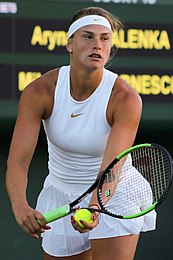
Original photo, 2018
-
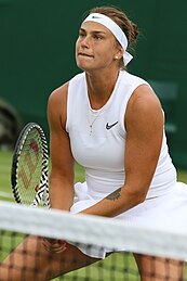
Option (A), 2019
-
Opption (B), 2019
-
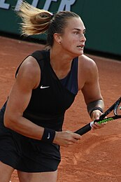
Option (C), 2021
-
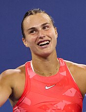
Option (D), 2023
-
Option (E), 2023
(following revert) As with Iga Świątek (discussion), Sabalenka is due for a newer photo. Her current one is in my view even more inadequate than Świątek's – her expression not looking like herself, the hair. I again didn't manage to take a perfect portrait (there for only a couple games and postmatch), but (D) seems like a marked improvement. Pinging @Jjj1238, Fyunck(click), and JamesAndersoon. Hameltion (talk | contribs) 04:44, 8 September 2023 (UTC)
- Original: I understand that everyone always wants a recent photo for the infobox, but I don't really think the original photo is that bad, and think the recent ones are not good alternatives. I don't think Sabalenka's appearance has changed much at all since 2018, and the original image still highlights what she looks like more or less, despite her just in general looking more youthful (which is of course obvious given she was 20 years old then). Option C is not a very good infobox image as it is a side profile, Option D has her looking a bit goofy and unprofessional, and Option E once again has her looking away with a near-side profile. The others are about as old as the original and do not offer anything that the original doesn't. My suggestion would be stick with the original and hope that a better recent image comes along soon. { [ ( jjj 1238 ) ] } 04:55, 8 September 2023 (UTC)
- In my opinion there are only two good photos in this batch. The original and option B from 2019. To be honest non look all the different in age. Options A, C, and E are kinda lousy looking. D I could live with but it needs to be waist and above for the infobox if possible.
I would stick with the original if I had my pick.Amended... a new version of option D that is cropped I now think is the best pic of all of these. It's the standard for an infobox... upper body, looking left (to the viewer), good quality, no heavy shadows. I would make sure that the current infobox pic is placed in the main body. Fyunck(click) (talk) 07:18, 8 September 2023 (UTC) - Actually, I can't add anything more from what others said. My pick would be the current picture since it represents her as she is and she hasn't changed so much since then. JamesAndersoon (talk) 12:48, 8 September 2023 (UTC)
Thanks, folks. I find the current one pretty unflattering but I guess I'm in the minority. Hameltion (talk | contribs) 15:27, 8 September 2023 (UTC)
- Actually, I also find it a bit unflattering but that a different question. I relooked at your option D, which sorta looked like she was being arrested. I cropped that photo to what I think would now be the best pic we have. I should have looked more carefully at potential. I didn't want to add it as a separate photo to wikimedia so I replaced and you can change it back if you don't like it. I did a temp save in the infobox at this edit and I think I like this version of your photo the best. It would need a new caption. Fyunck(click) (talk) 18:56, 8 September 2023 (UTC)
- Note everyone - Option D has been cropped with an infobox view at this edit. I did the edit and wanted to make sure everyone was aware it is now a different option D. Fyunck(click) (talk) 19:03, 8 September 2023 (UTC)
- I'd say the crop improves the photo for this use, though I'd take a bit more blue off the top. Hameltion (talk | contribs) 19:27, 8 September 2023 (UTC)
- A bit here a bit there is fine with me. Even a little taller. It's your photo upload. I wanted to show my idea of what I look for in an infobox photo and I think the arms were a distraction. It could be a separate upload by you if you want to use the original cropped photo someplace else. I did sharpen the pic a bit too as it was a little soft once I zoomed it. Fyunck(click) (talk) 19:51, 8 September 2023 (UTC)
- I still think her facial expression in D is not appropriate or flattering for an infobox photo, but it is definitely better than it was pre-crop. { [ ( jjj 1238 ) ] } 19:54, 8 September 2023 (UTC)
- I can understand your sentiments. To me she looks a bit too constipated in the original for the infobox... not flattering. But in D she looks a bit too goofy. I think I tend to err on the happy side rather than sad, but that is a personal preference. However wikipedia norm is upper body shot looking left and D fits that well. So does B. I suppose we could zoom in on B and do the same to it. Fyunck(click) (talk) 07:55, 9 September 2023 (UTC)
- If there is a problem with the facial expression in the original (I do not have a problem with it), I would sooner support A than D. { [ ( jjj 1238 ) ] } 11:30, 9 September 2023 (UTC)
- Hello,
- It's important to update the picrure of Aryna Sabalenka .
- The original picture is old and not reflecting the player currently.
- She doesn't wear a headband anymore.
- Picture D is clearly a better reflection of the reality. And Sabalenka is known to be a jovial player so that picture is matching her perfectly.
- Please accept the change. The current picture is not flattering or reflecting Sabalenka current style of play. Ocoudis (talk) 18:32, 10 April 2024 (UTC)
- If there is a problem with the facial expression in the original (I do not have a problem with it), I would sooner support A than D. { [ ( jjj 1238 ) ] } 11:30, 9 September 2023 (UTC)
- I can understand your sentiments. To me she looks a bit too constipated in the original for the infobox... not flattering. But in D she looks a bit too goofy. I think I tend to err on the happy side rather than sad, but that is a personal preference. However wikipedia norm is upper body shot looking left and D fits that well. So does B. I suppose we could zoom in on B and do the same to it. Fyunck(click) (talk) 07:55, 9 September 2023 (UTC)
- I still think her facial expression in D is not appropriate or flattering for an infobox photo, but it is definitely better than it was pre-crop. { [ ( jjj 1238 ) ] } 19:54, 8 September 2023 (UTC)
- A bit here a bit there is fine with me. Even a little taller. It's your photo upload. I wanted to show my idea of what I look for in an infobox photo and I think the arms were a distraction. It could be a separate upload by you if you want to use the original cropped photo someplace else. I did sharpen the pic a bit too as it was a little soft once I zoomed it. Fyunck(click) (talk) 19:51, 8 September 2023 (UTC)
- I'd say the crop improves the photo for this use, though I'd take a bit more blue off the top. Hameltion (talk | contribs) 19:27, 8 September 2023 (UTC)

I uploaded another zoomed image that hopefully doesn't look too goofy. Fyunck(click) (talk) 21:02, 10 April 2024 (UTC)
- @Fyunck(click): I apologize that I did not respond here, but I am not patrolling this talk page everyday and it has just been a few weeks since your post. Please do not revert anything on the main page regarding the infobox image until a consensus is established. I have two thoughts here: 1) there is no need to change the image. Infobox images do not change according to what is most recent but according to what is the best image for the infobox, and I don't think any of the more recent images are that; 2) I do not find that any of the 2023 US Open images make for a suitable image for a variety of reasons, be it the quality of the image itself or Sabalenka's facial expression. I do not oppose changing the image if we find a better one, but I have seen no alternatives that would be an improvement over the current. Finally, there is still no rush, Sabalenka will be playing tennis all year, there is a good chance that new images will emerge this year and one may be perfect to use. We don't need to change it now with no great alternatives. { [ ( jjj 1238 ) ] } 20:17, 1 May 2024 (UTC)
- When you post something here and 4 weeks go by without objection, you have consensus. We had someone complain rightly that the original photo isn't very good. In the past discussion most seemed to want something other than the original. Seven months and 25 days since this original discussion started is not a rush in the least. This new photo is much better than the original and you are likely in the minority @Ocoudis: @Hameltion: @JamesAndersoon: for thinking otherwise. Here is the link to the article before you reverted it. Fyunck(click) (talk) 20:44, 1 May 2024 (UTC)
- Silence is not consensus. Silence is silence. There was no consensus as you were the only person who agreed to this new image, not even the person who initiated the new discussion did. You were bold, your edit was reverted, so you then begin a discussion about it. As I said, I am not opposed to changing the image, I just don't think the new one is a good alternative and I have yet to see an explanation as to why the existing image should no longer be used. To go back to the previous discussion, I rank options A, B, and C all above the 2023 US Open images. I do not find them to be flattering images for an infobox, and I also think if used they should be re-cropped for more of a portrait frame like the other options offered had. { [ ( jjj 1238 ) ] } 22:27, 1 May 2024 (UTC)
- Actually silence is consensus at Wikipedia. I posted my change for all to see and mentioned it here. It's not my fault if you didn't reply. Perhaps you are correct and no one would like the update from a month ago. We'll see, but if one of them reverts you I wouldn't add back the poor original again. If you are waiting for the perfect image that could take decades as most player infobox images are far from perfect... they're just the best we have thus far. Fyunck(click) (talk) 22:53, 1 May 2024 (UTC)
- My first choice remains my (D) but I'm with jjj that the one of her adjusting her shirt isn't our best candidate. Hameltion (talk | contribs) 23:04, 1 May 2024 (UTC)
- I can certainly flip to D as the last poster wanted, just to get off the old shot. That would put three at D. Fyunck(click) (talk) 00:07, 2 May 2024 (UTC)
- I certainly agree flip it to D. It is a Better picture, cropped so we can see her face better and she's smiling. And most importantly this reflects her current style of play (she doesn't wear the hand and since 3-4 years).
- I think we can all agree to use picture D! Thank you in advance. Ocoudis (talk) 00:51, 3 May 2024 (UTC)
- I can certainly flip to D as the last poster wanted, just to get off the old shot. That would put three at D. Fyunck(click) (talk) 00:07, 2 May 2024 (UTC)
- Silence is not consensus. Silence is silence. There was no consensus as you were the only person who agreed to this new image, not even the person who initiated the new discussion did. You were bold, your edit was reverted, so you then begin a discussion about it. As I said, I am not opposed to changing the image, I just don't think the new one is a good alternative and I have yet to see an explanation as to why the existing image should no longer be used. To go back to the previous discussion, I rank options A, B, and C all above the 2023 US Open images. I do not find them to be flattering images for an infobox, and I also think if used they should be re-cropped for more of a portrait frame like the other options offered had. { [ ( jjj 1238 ) ] } 22:27, 1 May 2024 (UTC)
- Hi @Ocoudis, I really like the color correction you did to this photo of mine (05), but I don't think it has an ideal angle for an infobox and has a bit much empty space. Did a tiny bit of processing to swap back in my preferred portrait photo (06) – would you be willing to edit that one to have good bright colors as well? Thanks. Hameltion (talk | contribs) 22:42, 29 August 2024 (UTC)
- When you post something here and 4 weeks go by without objection, you have consensus. We had someone complain rightly that the original photo isn't very good. In the past discussion most seemed to want something other than the original. Seven months and 25 days since this original discussion started is not a rush in the least. This new photo is much better than the original and you are likely in the minority @Ocoudis: @Hameltion: @JamesAndersoon: for thinking otherwise. Here is the link to the article before you reverted it. Fyunck(click) (talk) 20:44, 1 May 2024 (UTC)
- Wikipedia good articles
- Sports and recreation good articles
- Biography articles of living people
- GA-Class biography articles
- GA-Class biography (sports and games) articles
- Low-importance biography (sports and games) articles
- Sports and games work group articles
- WikiProject Biography articles
- GA-Class Women's sport articles
- High-importance Women's sport articles
- GA-Class Women's tennis articles
- High-importance Women's tennis articles
- Women's tennis task force articles
- Automatically assessed Women's sport articles
- WikiProject Women articles
- GA-Class tennis articles
- High-importance tennis articles
- WikiProject Tennis articles
- GA-Class Belarus articles
- Low-importance Belarus articles
- Pages in the Wikipedia Top 25 Report


