
File:Denver population Density by Race-Ethnicity, 2010.jpg

Original file (1,265 × 978 pixels, file size: 624 KB, MIME type: image/jpeg)
| This is a file from the Wikimedia Commons. Information from its description page there is shown below. Commons is a freely licensed media file repository. You can help. |
Summary
| Description |
This map allows you to quickly glimpse at an area and see its racial/ethnic makeup and population density. Each dot on this map represents 25 people, and dots are placed randomly within each Census Tract. Dots are color-coded by race/ethnicity. Areas with more dots are more densely populated, and areas with fewer dots are less densely populated. For example, looking the five neighborhoods in Near Northeast, you can see Five Points, Cole and Whittier are more densely populated than Clayton and Skyland. And while Cole has a predominantly Hispanic population, Whittier is more heavily African-American and white. This map was made using 2010 Decennial Census data from the U.S. Census Bureau. For more visualization and analysis of Census data, visit piton.org/census2010. View more maps of the Children’s Corridor |
| Date | |
| Source | Population Density by Race/Ethnicity, 2010 |
| Author | Piton Foundation |
Licensing
- You are free:
- to share – to copy, distribute and transmit the work
- to remix – to adapt the work
- Under the following conditions:
- attribution – You must give appropriate credit, provide a link to the license, and indicate if changes were made. You may do so in any reasonable manner, but not in any way that suggests the licensor endorses you or your use.
| This image was originally posted to Flickr by Piton Foundation at https://flickr.com/photos/87735858@N07/8044584167. It was reviewed on 18 February 2016 by FlickreviewR and was confirmed to be licensed under the terms of the cc-by-2.0. |
File history
Click on a date/time to view the file as it appeared at that time.
| Date/Time | Thumbnail | Dimensions | User | Comment | |
|---|---|---|---|---|---|
| current | 01:17, 18 February 2016 | 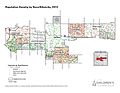 | 1,265 × 978 (624 KB) | Yoninah | {{Information |Description=This map allows you to quickly glimpse at an area and see its racial/ethnic makeup and population density. Each dot on this map represents 25 people, and dots are placed randomly within each Census Tract. Dots are color-coded... |