
File:202003- Cumulative county COVID-19 death rates - by share of votes for Donald Trump.svg

Size of this PNG preview of this SVG file: 800 × 600 pixels. Other resolutions: 320 × 240 pixels | 640 × 480 pixels | 1,024 × 768 pixels | 1,280 × 960 pixels | 2,560 × 1,920 pixels | 1,000 × 750 pixels.
Original file (SVG file, nominally 1,000 × 750 pixels, file size: 8 KB)
| This is a file from the Wikimedia Commons. Information from its description page there is shown below. Commons is a freely licensed media file repository. You can help. |
Summary
| Description |
English: Line charts showing cumulative death rates for counties, categorized based on Donald Trump's share of votes received in 2020 election
|
||
| Date | |||
| Source | Own work | ||
| Author | RCraig09 |
Licensing
I, the copyright holder of this work, hereby publish it under the following license:
This file is licensed under the Creative Commons Attribution-Share Alike 4.0 International license.
- You are free:
- to share – to copy, distribute and transmit the work
- to remix – to adapt the work
- Under the following conditions:
- attribution – You must give appropriate credit, provide a link to the license, and indicate if changes were made. You may do so in any reasonable manner, but not in any way that suggests the licensor endorses you or your use.
- share alike – If you remix, transform, or build upon the material, you must distribute your contributions under the same or compatible license as the original.
File history
Click on a date/time to view the file as it appeared at that time.
| Date/Time | Thumbnail | Dimensions | User | Comment | |
|---|---|---|---|---|---|
| current | 18:05, 20 March 2024 |  | 1,000 × 750 (8 KB) | RCraig09 | Version 4: Make vertical gridlines less dominant (to improve readability of legend text) |
| 07:04, 20 March 2024 | 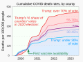 | 1,000 × 750 (8 KB) | RCraig09 | Version 3: change background gradient colors | |
| 17:57, 17 March 2024 |  | 1,000 × 750 (7 KB) | RCraig09 | Version 2: add indication of "First vaccine availability" | |
| 20:23, 14 March 2024 |  | 1,000 × 750 (7 KB) | RCraig09 | Uploaded own work with UploadWizard |
File usage
The following pages on the English Wikipedia use this file (pages on other projects are not listed):
- COVID-19 misinformation by the United States
- COVID-19 pandemic in the United States
- COVID-19 vaccine
- COVID-19 vaccine hesitancy in the United States
- COVID-19 vaccine misinformation and hesitancy
- Communication of the Trump administration during the COVID-19 pandemic
- False or misleading statements by Donald Trump
- Vaccine
- Vaccine hesitancy
- Talk:COVID-19 vaccine misinformation and hesitancy